
The Ultimate Guide to Watercolor Paint
Mar 03, 2025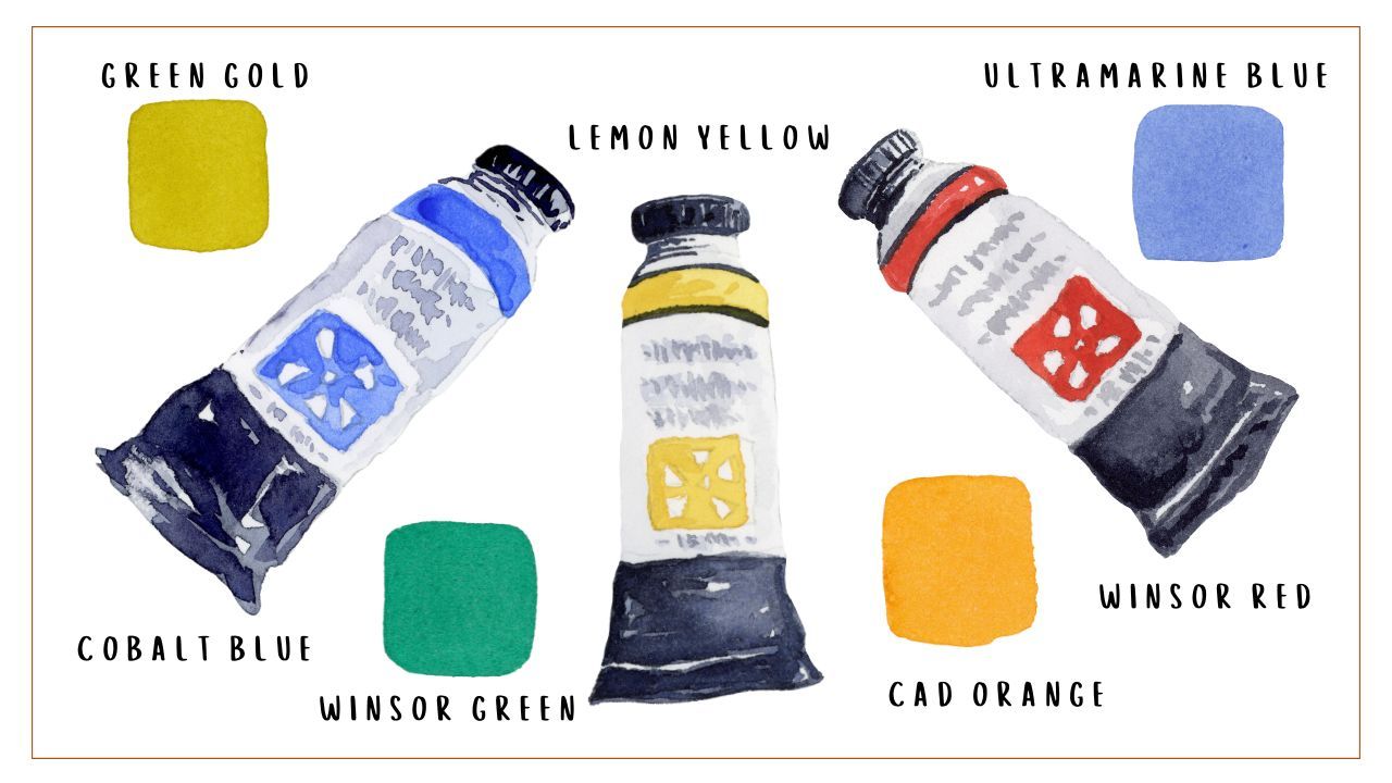
Watercolor paints come in all colors, shapes, sizes, and textures. They can come in compressed, dried cakes fitted in pans or in liquid form in tubes. They vary in pigment density, granularity, transparency, and lightfastness. Not to mention the seemingly endless options when it comes to brand and color. With all of these components to consider, how do you choose what’s right for you and your painting process?
My over-arching recommendation is this: Start with a manageable number of high-quality paints. Don’t just buy the biggest set you can afford or default to the one that has your favorite colors. Invest in a solid set of paints that sets you up for successful color mixing. But how does one define a quality paint? And which colors do you actually need?
What Makes Good Paint
While “good” paint is partially determined by preference, there are some key characteristics that mark a paint as high quality:
- Pigment dense (lots of pure pigment and little filler)
- Single pigment (as opposed to a mix of multiple pigments)
- High lightfastness rating (resists fading)
- High transparency (for optimal layering)
Pigment
Watercolor paints are primarily made of pigment mixed with a water-soluble binder. Pigments are finely ground powders that come from natural or artificial (man-made) sources. These powders are what determine the color of your paint. High-quality watercolors contain large amounts of pigment. Paints created with a single pigment are more predictable and tend to be more vivid than their multi-pigment (or convenience color) counterparts. Paints made with multiple pigments have a higher risk of becoming muddy when mixed with other colors.
Lightfastness
Lightfastness relates to a paint’s degree of permanence and describes how likely a paint is to fade if exposed to light. Lightfastness can be rated by using the ASTM (American Society for Testing and Materials) lightfastness scale, which moves from I (excellent) to V (very poor). If your paint is labeled NR, that means it has not been rated by the ASTM.
Transparency
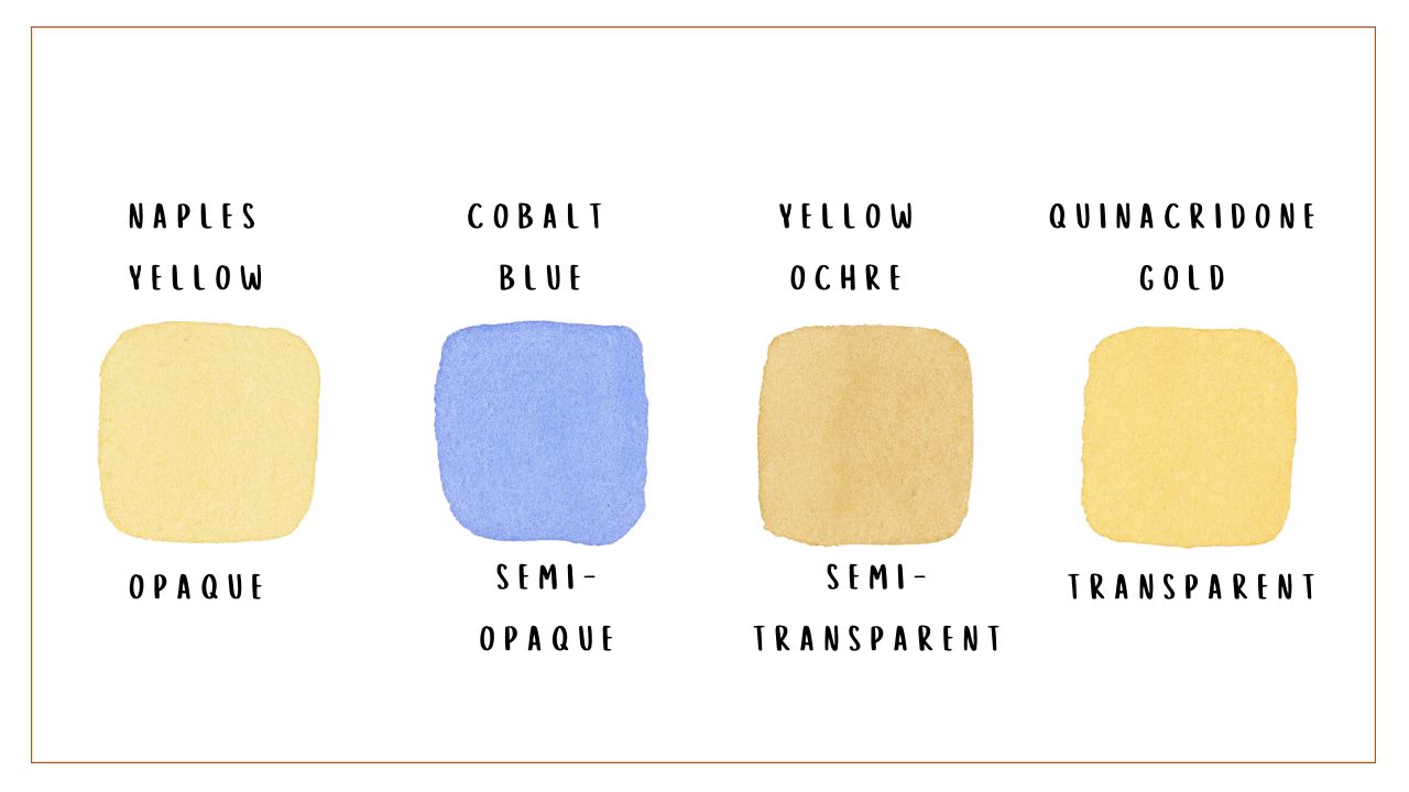
While all watercolor paints are translucent (partially see-through), some pigments are more opaque than others. As such, watercolor paints are often classified as transparent, semi-transparent, semi-opaque, or opaque (on labels, this is often indicated with a square that is more or less colored in depending on how opaque that paint is). Because they don’t fully obscure the layers beneath them, transparent paints layer more beautifully. However, you can easily work around this by using more opaque colors for underpaintings and more translucent colors for glazes.
Quality Grades
Generally, watercolors are divided into three quality grades or classifications: student, artist, and professional. The major differences between each grade lie in both the quality and quantity of pigment used in the paint itself as well as its lightfastness.
Student-grade paints are the cheapest and lowest quality option. They have the least amount of pure pigment and may include significant amounts of filler, which results in less vibrant colors that may not blend as seamlessly as an artist or professional-grade paint. They also often have poorer lightfastness, meaning that their colors may fade over time when exposed to light. However, as with all things, there is a range of quality within the student grade. The Winsor & Newton™️ Cotman Watercolor Paint Field Set I use in my Watercolor 101 course is an example of a great quality student grade set.
Artist-grade paints are the next step up the ladder in terms of quality. These paints have higher-quality pigments that result in more vibrant and rich colors that resist fading. They contain fewer fillers and more pure pigment. Once you’re more comfortable with watercolor, I suggest building a collection of paints at this level.
Professional grade paints are just that: the highest quality paints that are made with professional artists in mind. They have both the highest quality and quantity of pigments in them and have the best lightfastness and color consistency.
Trusted Brands
I don’t subscribe to one particular brand at this time. Instead, I use what’s available to me. Some of my favorite brands at the moment are Winsor & Newton™️, Daniel Smith™️, Daler-Rowney®, and Da Vinci.
Pans vs Tubes
Watercolor paints are mainly packaged in two ways: pans and tubes. Modern pans are typically plastic or metal receptacles that hold dried cakes of compressed and concentrated paint. Because the paint is dehydrated, it needs to be reactivated with water before being used. Because they can neatly fit in a palette or slim box, pans are convenient for painting on the go or for when storage space is tight. Ready-to-use pans are often sold in sets with pre-determined colors and are great for initially establishing a practice. Alternatively, you can buy empty pans (or a palette with built-in pans) and fill them yourself with tube paint.
Tubes contain liquid paint that can immediately be used to start painting. Because the paint is hydrated, it is slightly less concentrated than pan paint. Tubes can easily be purchased individually or in a set; this makes it easier to build a customized palette full of the colors you know you’ll use. While individual tubes can feel more expensive than buying a ready-to-use pan paint set, because you can easily buy larger sizes and prioritize only the colors you need, they can be more economical in the long run. I personally use paint tubes and refill my palette as necessary.
Volume
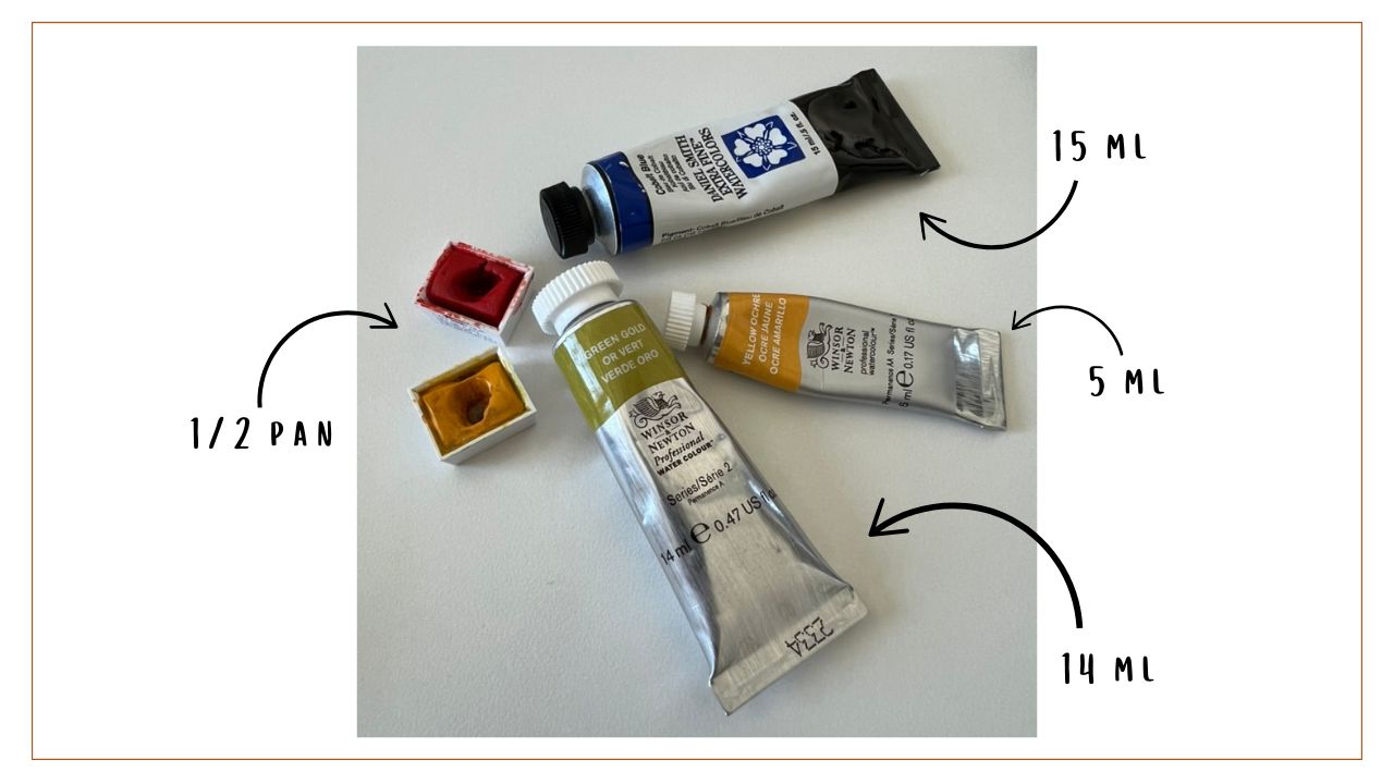
Watercolor paints are sold in a wide variety of sizes. Tubes can often be found at 5, 10, 14, 15, 21, and 37 milliliters, with 5 and 15 being the most common. For pans, you can use traditional shell pans, eighth, quarter, half, or full pans. Half and full pans are the most common sizes, with half pans holding approximately 2.5 milliliters of paint and full pans approximately 5 milliliters.
Bare-bone Basics: What Colors Do I Really Need?
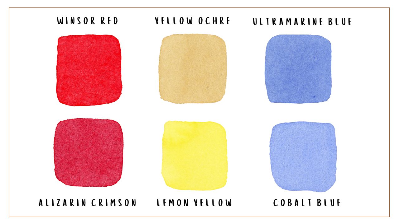
If you’re just getting started and you want to purchase as few paints as possible, you can get by with a warm and cool version of each primary color. That could look like:
- A warm red like Winsor Red
- A cool red like Alizarin Crimson
- A warm yellow like Yellow Ochre
- A cool yellow like Lemon Yellow
- A warm blue like Ultramarine Blue
- A cool blue like Cobalt Blue
Having a warm and cool version of red, yellow, and blue gives you everything you need to mix a vast array of colors. Starting with such a minimal palette will also quickly bolster your color mixing skills. You’re forced to experiment with your paints, and doing so will help you gain confidence with color mixing more quickly.
However, if you want to make your life a little easier, adding a few more paints can be incredibly helpful. For added convivence, I suggest investing in additional colors that align with your favorite subjects and color schemes. For instance, if you’re painting lots of moody landscapes, adding Neutral Tint, Burnt Umber, and Indigo to your palette would be helpful. If you’re drawn to bright flowers, adding Quinacridone Gold, Quinacridone Magenta, and Cadmium Orange can open up a new world of underpainting and glazing colors. If you find yourself constantly mixing greens, adding a few pre-mixed options to your palette can be great (some of my favorites are Hooker’s Green, Winsor Green, and Green Gold). Experimenting with a few classic neutrals like Burnt Sienna or Raw Umber also never goes awry!
While it can be tempting to build an epic collection of paints representing every color under the sun, curating a small but hardworking palette can help build your color mixing abilities and unify your paintings. I go over my preferred palette of 14 colors in my How to Get Started with Watercolor post.
Understanding Labels and Classifications
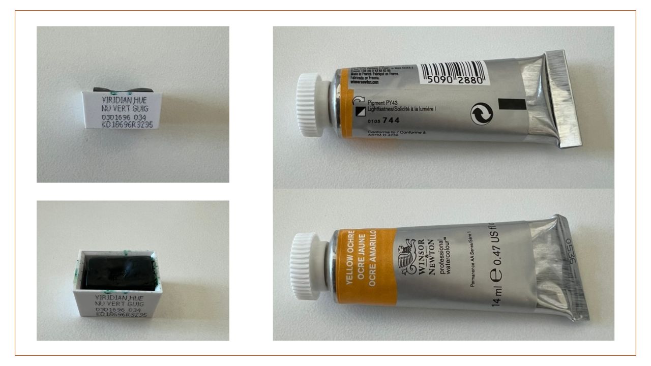
Regardless of whether you purchase tubes or pans, most watercolors come with labels that provide you with a lot of information. Some parts of these labels are more self-explanatory than others; for instance, the generic color name and branding probably won’t throw you. But between the grade, series, permanence, and that little square, it can get a bit confusing. So let’s break down each element in a typical watercolor label.
Note that not all of the terms listed below will necessarily be on the labels of your paints; to find more about the specifications for any given paint, you may need to consult that particular paint’s product details or review the manufacturer’s color chart.
Color Name – each watercolor label should clearly state the generic color name; often provided in multiple languages
Brand Name – often centrally located on the label
Grade – indicates the overall quality classification of the paint (student, artist, or professional)
Series – indicates the price; often listed as a number from 1 (least expensive) to 4 or 5 (most expensive)
Pigment Name – the exact pigments used in your paint are identified with a universal color index name; each one begins with “P” for pigment, followed by letters indicating the color category (Y for yellow, O for orange, R for red, and so on) and a number detailing the placement in the color index; single pigment paints will only contain one color index name, while multiple pigment paints will list all the color index names used in that particular paint
Vehicle (Binder) – suspend the pigment in the paint solution and help it adhere, or “bind,” to the paper; the most common vehicle for watercolor paints is gum arabic
Lightfastness – indicates the paint’s resistance to fading if exposed to light; often indicated with a Roman numeral (I being best and V worst)
Permanence – a relatively broad classification that combines lightfastness and general atmospheric sturdiness with the chemical stability of the paint’s composition; ratings include AA (extremely permanent), A (permanent), B (moderately durable), and C (fugitive); note that certain pigments tend to be more stable than others, so a paint’s permanence doesn’t necessarily determine its quality
Opacity – how translucent a paint is; may be indicated with a square (the more it is colored in, the more opaque that paint is)
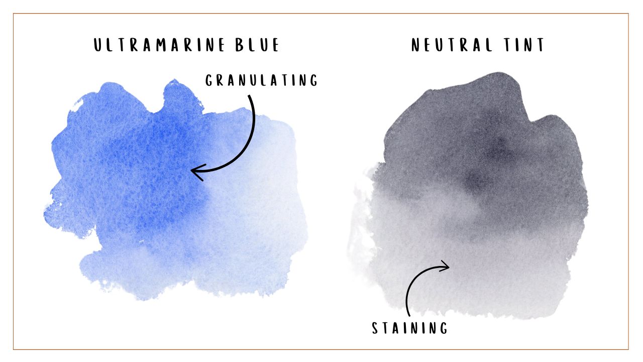
Staining (ST) – describes how definitively the pigments in the paint “stain” or penetrate the paper; higher staining ratings make lifting more difficult
Granularity (G) – pigments that have large or irregularly-shaped particles tend to clump together, or “granulate,” on your paper, while pigments with finer particles are more soluble and don’t settle in the same way; labels typically indicate whether a paint granulates or doesn’t
Certification Seal – AP (Approved Product) paints are considered non-toxic; CL (Cautionary Labeling) paints may have potentially harmful ingredients and should not be used around children
Volume – amount of paint
Want a particular topic covered here?
Fill out the form below and let me know what you want to learn more about.
I hate SPAM. I will never sell your information, for any reason.

